Rise Athletics
Rise Athletics
Building a Brand That Moves With You
Building a Brand That Moves With You

Spoiler: It Turned Out Great.
Spoiler: It Turned Out Great.
Spoiler: It Turned Out Great.


Overview
Overview
Overview
Brand Built Before the Move: Insider Strategy That Works
Brand Built Before the Move: Insider Strategy That Works
Brand Built Before the Move: Insider Strategy That Works
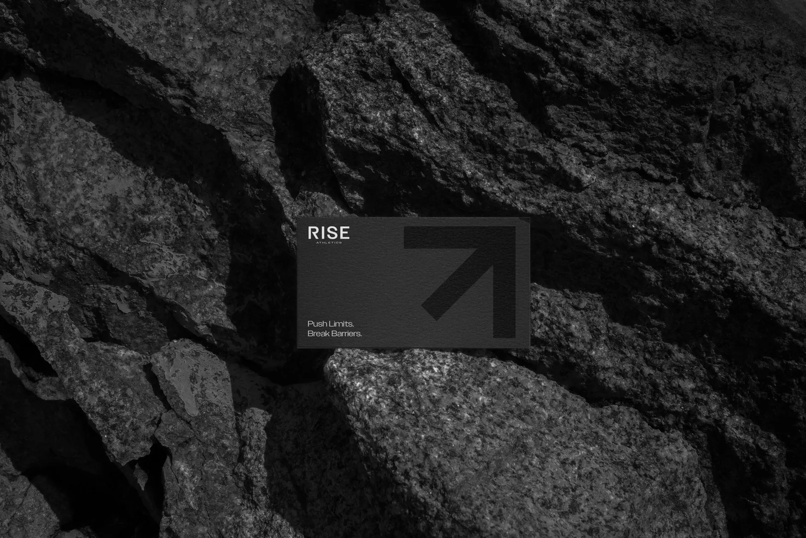
Rise Athletics was expanding. New facility, new energy, new positioning in the market. They needed a brand identity that felt earned, not generic. We built a complete logo system, color palette, typography, and merch line in four weeks, launching with their facility move. The work hit because it came from years of knowing their community.
Rise Athletics was expanding. New facility, new energy, new positioning in the market. They needed a brand identity that felt earned, not generic. We built a complete logo system, color palette, typography, and merch line in four weeks, launching with their facility move. The work hit because it came from years of knowing their community.
Client:
Client:
Rise Athletics
Rise Athletics
Industry:
Industry:
Fitness
Fitness
Agency
Agency
Chalant
Chalant
Production Company
Production Company
-
-
Project Type
Project Type
Brand Identity System
Brand Identity System
Timeline:
Timeline:
January to February 2025
January to February 2025
Location
Location
📍 Winter Garden, FL
📍 Winter Garden, FL
Deliverables
Deliverables
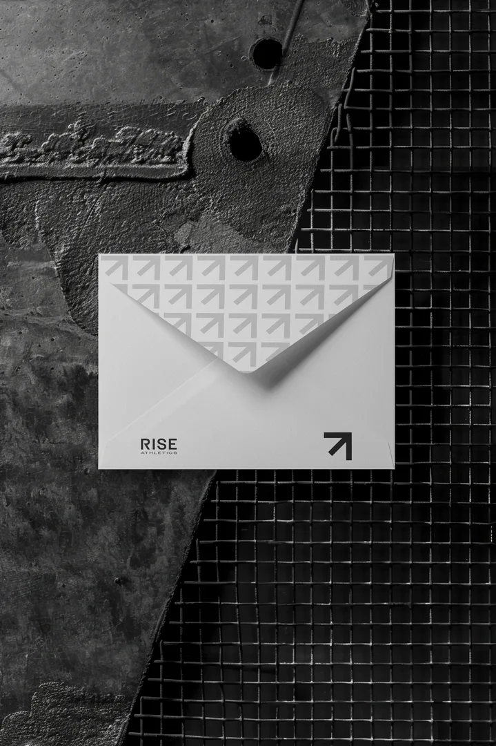
Logo family, color palette, typography system, merch line
Logo family, color palette, typography system, merch line
Before We Got Involved
Before We Got Involved
Before We Got Involved
Rise Athletics had identity. They had members who showed up, trusted the programming, got results. What they didn't have was a visual brand that matched the energy and commitment they'd built. They were moving to a bigger facility, which meant an opportunity to launch something bigger visually too.
We came in with an advantage. McClain had trained there for years. We knew the space, knew the culture, knew what it felt like to be part of Rise. That matters. It meant we weren't importing some trendy fitness brand aesthetic from the internet. We were building something that actually fit.
What We Did Differently
What We Did Differently
What We Did Differently
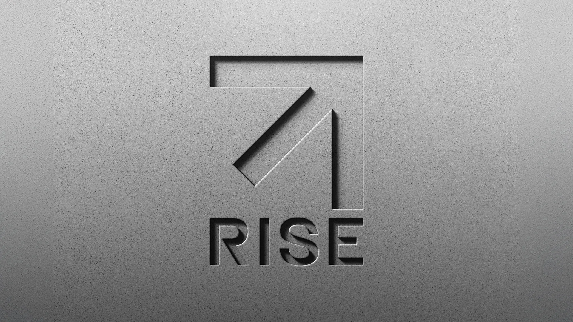
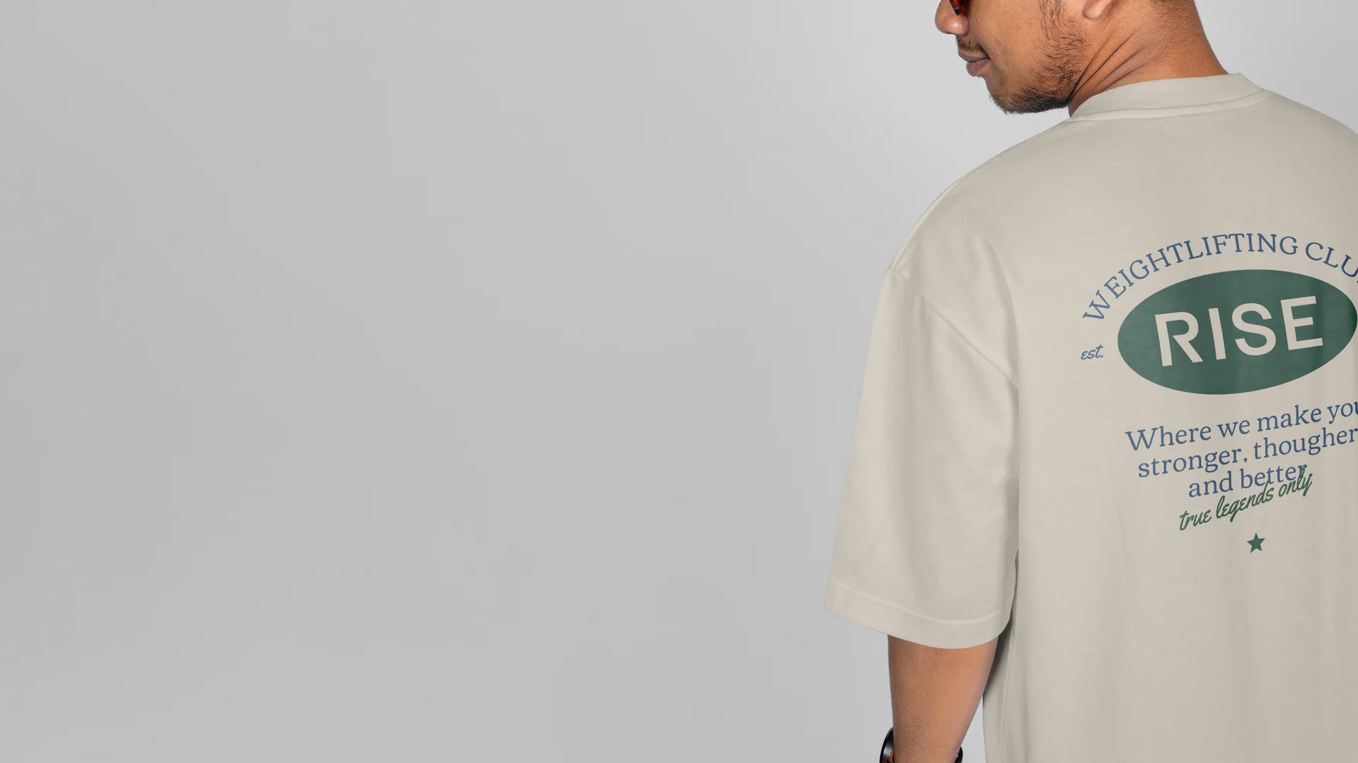
The Phoenix Evolved, Not Replaced
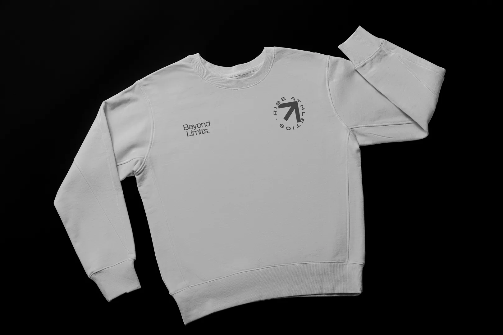
A lot of brands want to throw out their old identity and start from scratch when they rebrand. Rise didn't need that. They had a phoenix in their original mark. Our creative director Valentim evolved it. The phoenix became more abstract, more geometric, more modern. It maintained the connection to what came before while clearly moving forward.
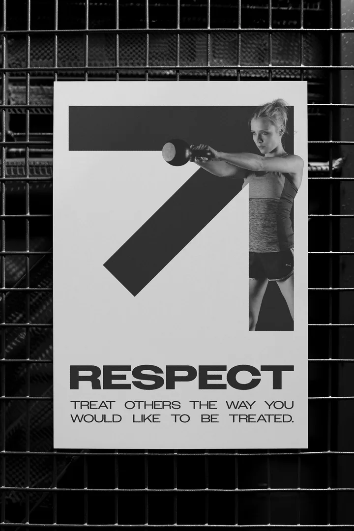
From that evolution came a whole logo family. Five variants that worked across different applications, from apparel to signage to digital. Every mark carried the phoenix idea but served a different purpose. That's a real system, not just one logo in different colors.
Color and Type That Reads Like Rise
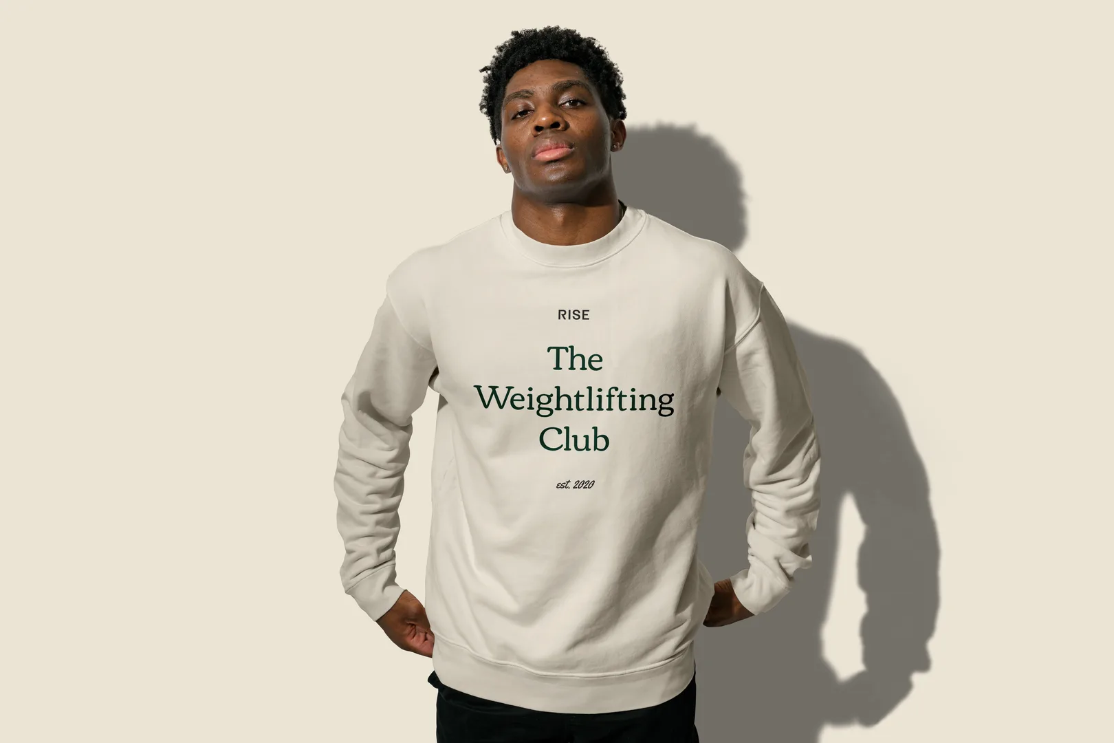
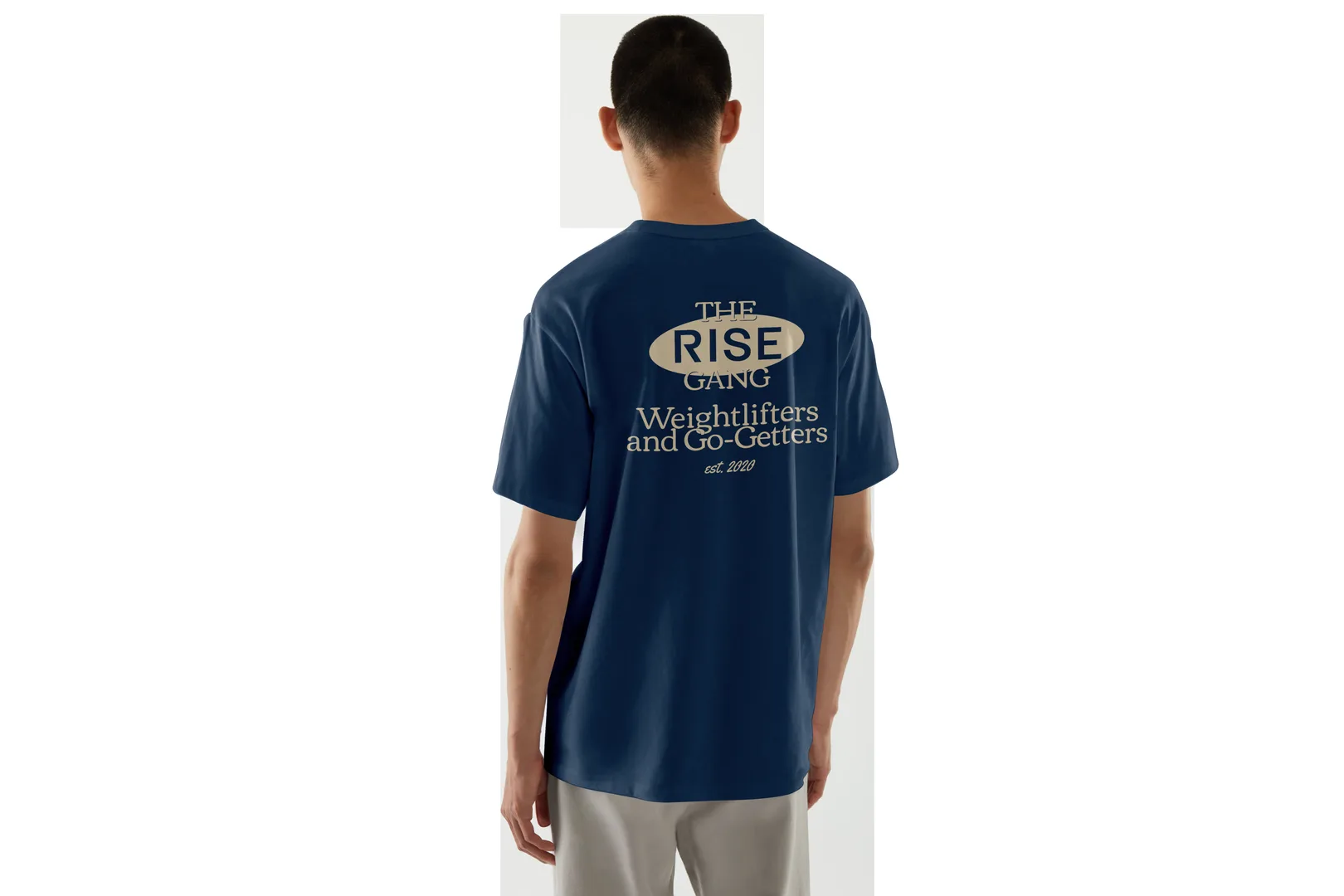
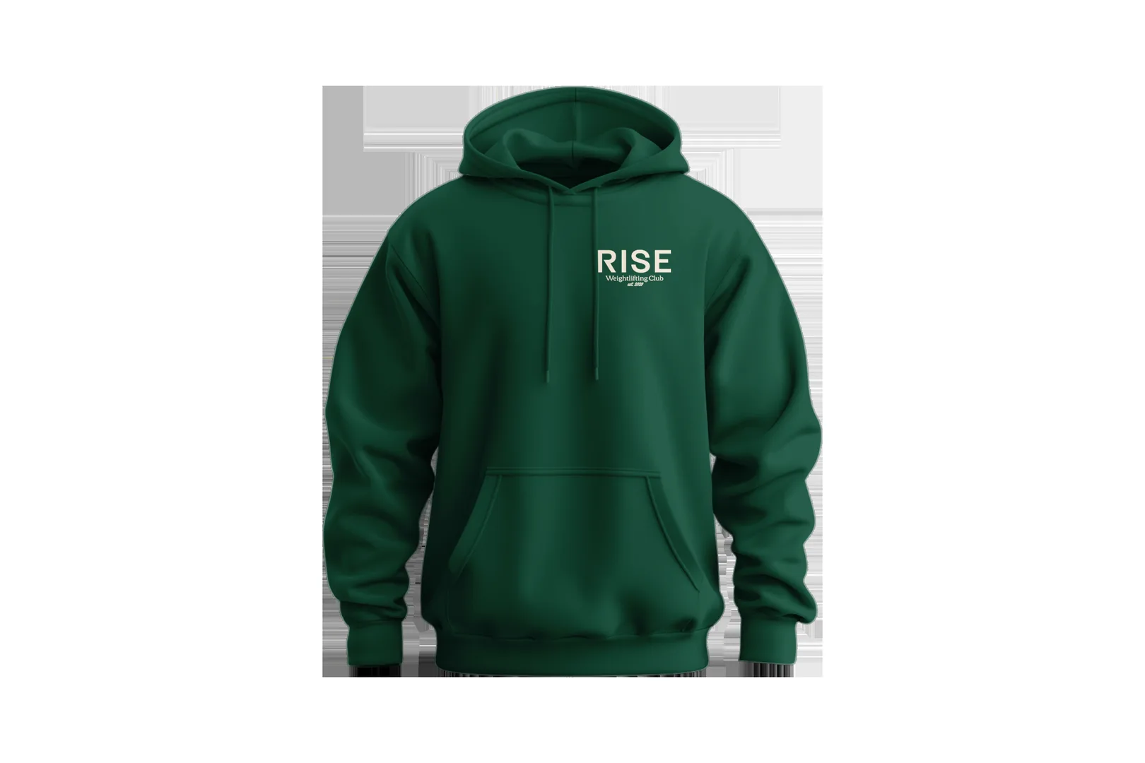
The palette was intentional. Muted dark green, near-black tones, ranges of gray. Not the bright, primary-color fitness aesthetic that fills the category. This felt more adult, more serious, more earned. The typography was Owners. Clean, strong, contemporary. It matched the vibe.
These choices added up. The brand looked like a place where serious athletes train, not a place that's trying to look cool. That's the opposite of most fitness branding.
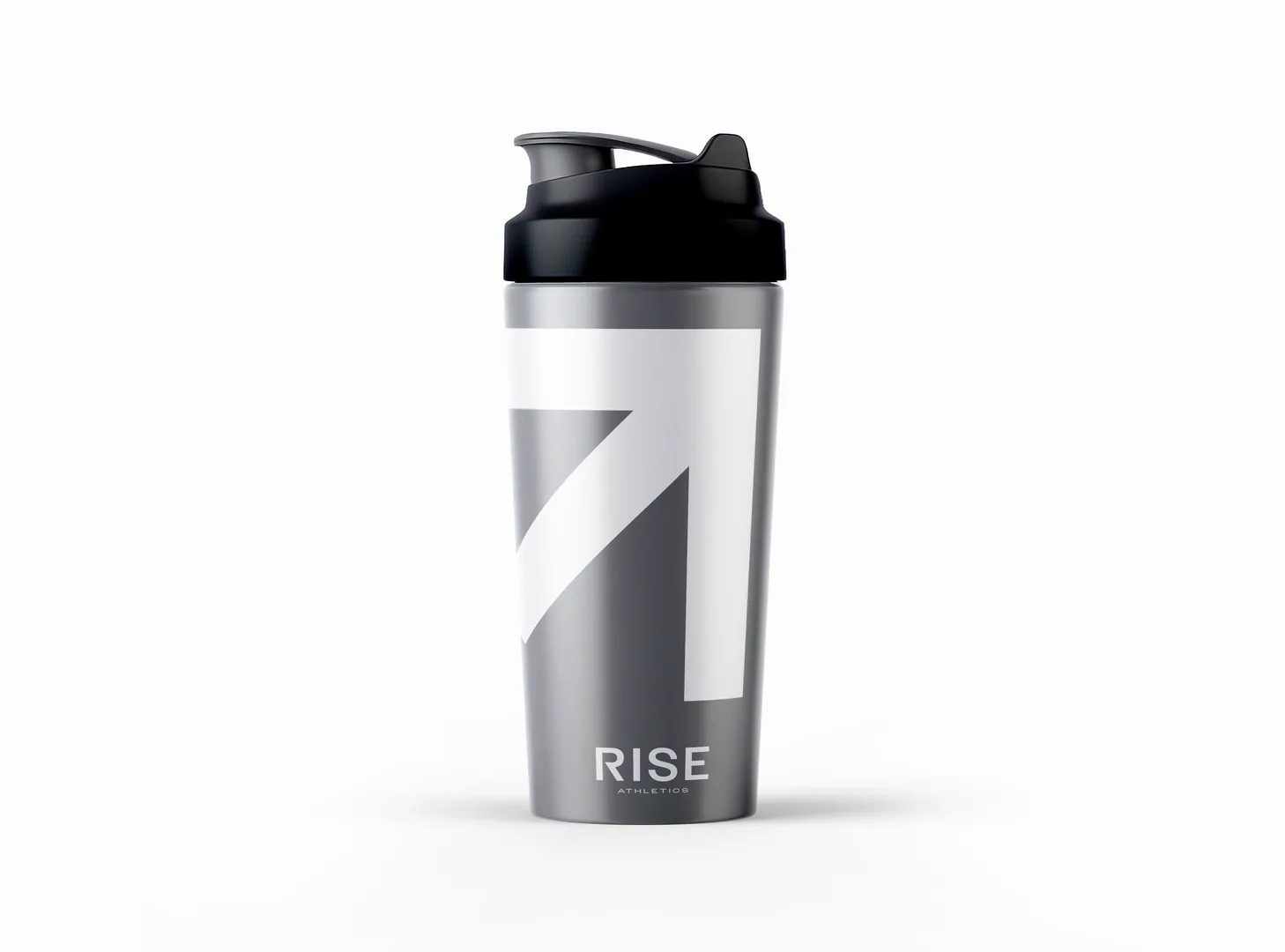
Merch People Actually Wanted to Wear
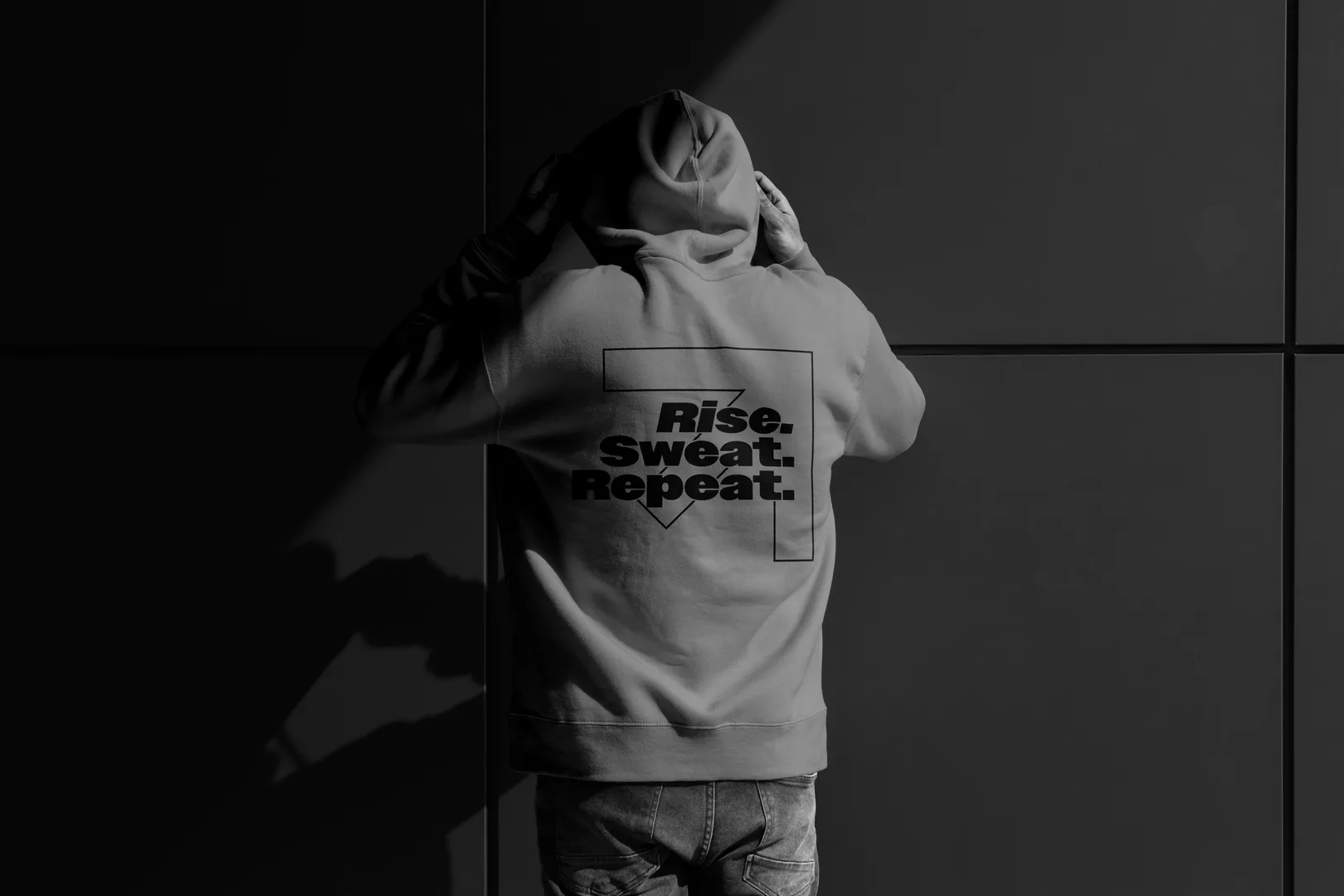
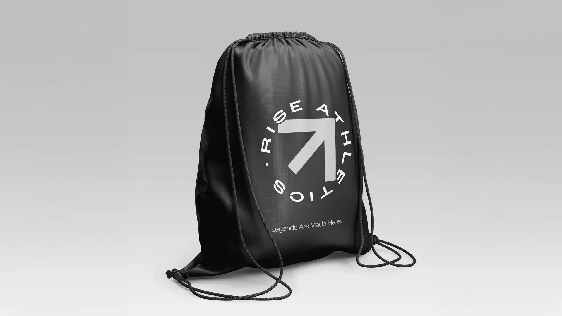
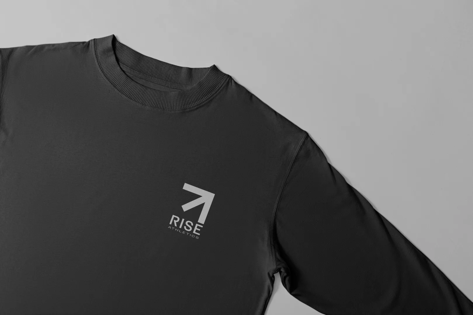
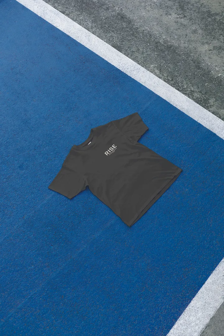
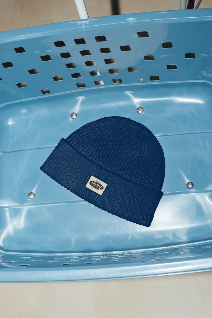
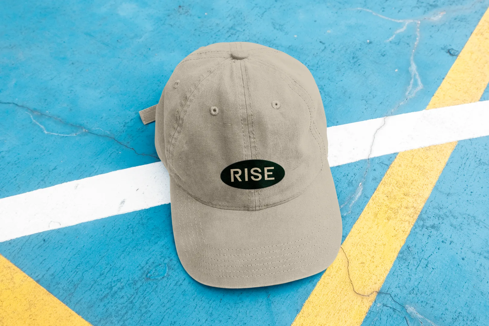
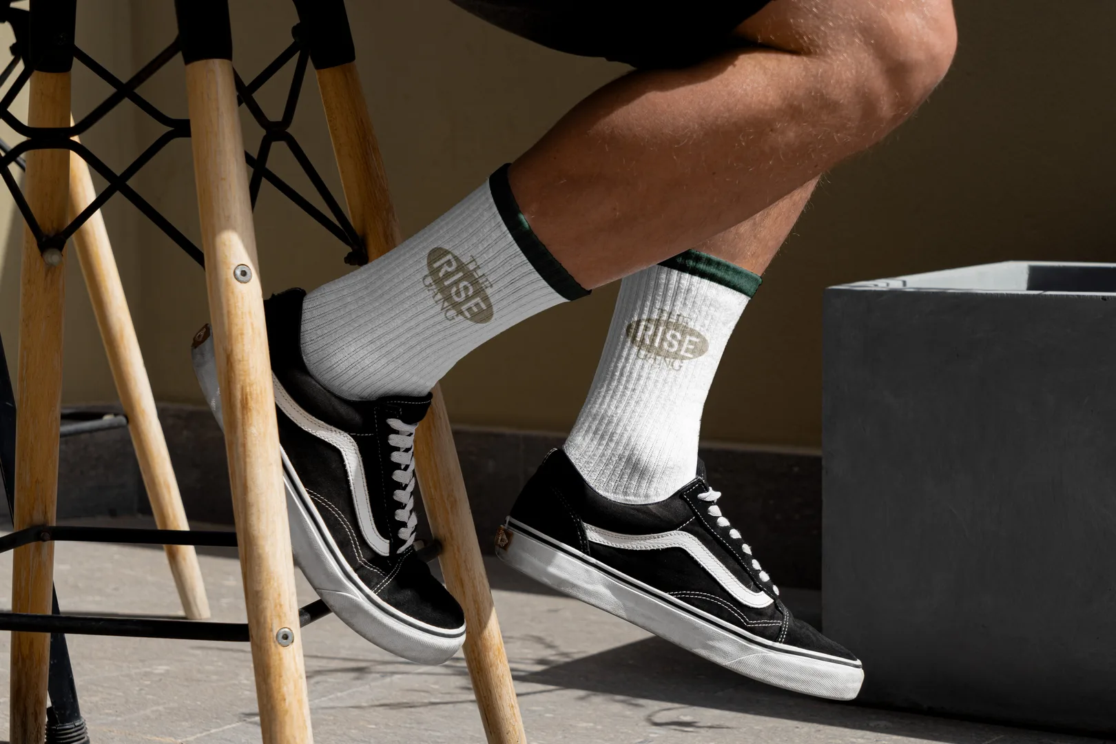
A lot of gym brands make merchandise as an afterthought. Rise approached it differently. We designed bottles, bags, hats, stationery. Then we built the Pump Line, a set of hoodies and apparel that went beyond generic branded gym wear. The designs worked on the garments. The proportions made sense. The colors actually looked good on people.
That matters. When your merch is something people genuinely want to wear outside the gym, your brand goes with them. That's distribution. That's extending the community beyond the walls.
The Phoenix Evolved, Not Replaced
A lot of brands want to throw out their old identity and start from scratch when they rebrand. Rise didn't need that. They had a phoenix in their original mark. Our creative director Valentim evolved it. The phoenix became more abstract, more geometric, more modern. It maintained the connection to what came before while clearly moving forward.
From that evolution came a whole logo family. Five variants that worked across different applications, from apparel to signage to digital. Every mark carried the phoenix idea but served a different purpose. That's a real system, not just one logo in different colors.
Color and Type That Reads Like Rise
The palette was intentional. Muted dark green, near-black tones, ranges of gray. Not the bright, primary-color fitness aesthetic that fills the category. This felt more adult, more serious, more earned. The typography was Owners. Clean, strong, contemporary. It matched the vibe.
These choices added up. The brand looked like a place where serious athletes train, not a place that's trying to look cool. That's the opposite of most fitness branding.
Merch People Actually Wanted to Wear
A lot of gym brands make merchandise as an afterthought. Rise approached it differently. We designed bottles, bags, hats, stationery. Then we built the Pump Line, a set of hoodies and apparel that went beyond generic branded gym wear. The designs worked on the garments. The proportions made sense. The colors actually looked good on people.
That matters. When your merch is something people genuinely want to wear outside the gym, your brand goes with them. That's distribution. That's extending the community beyond the walls.
Results
Results
Results
Complete logo family with five variants for different applications
Cohesive color palette and typography system applied across all touchpoints
Merchandise line including bottles, bags, hats, and stationery with integrated branding
Pump Line apparel (hoodies and athletic wear) with contemporary design
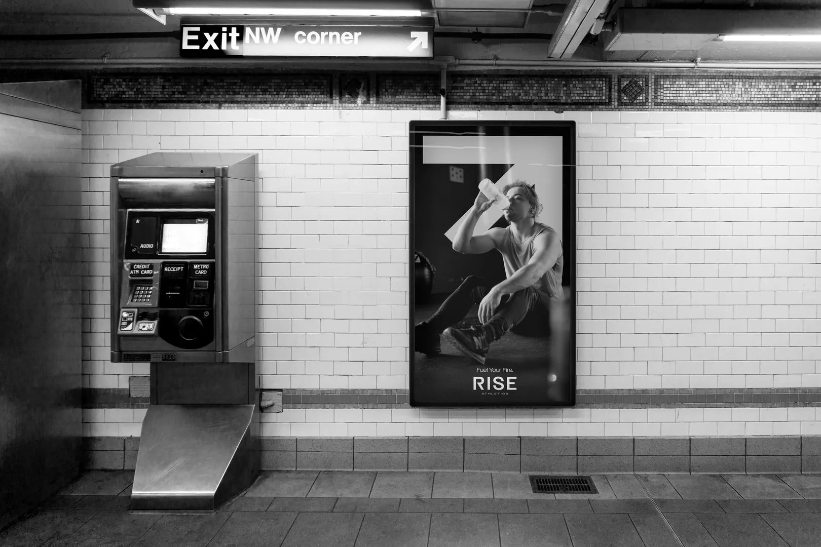
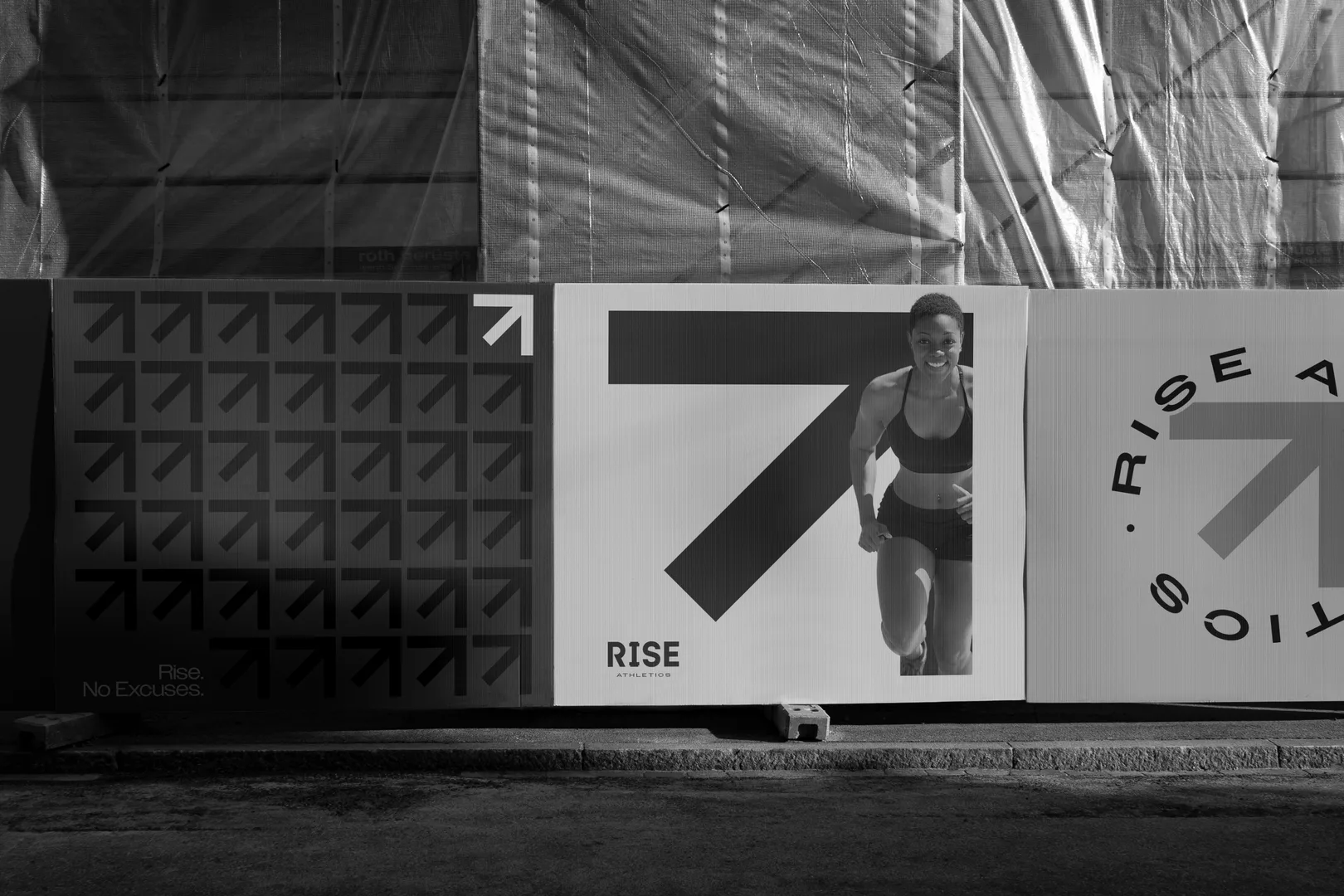
Brand launch coordinated with facility move and Phase 01 positioning
All deliverables completed in four weeks
Brand system built and ready before facility opening, not after
Complete logo family with five variants for different applications
Cohesive color palette and typography system applied across all touchpoints
Merchandise line including bottles, bags, hats, and stationery with integrated branding
Pump Line apparel (hoodies and athletic wear) with contemporary design
Brand launch coordinated with facility move and Phase 01 positioning
All deliverables completed in four weeks
Brand system built and ready before facility opening, not after
What We Learned
What We Learned
What We Learned
Insider knowledge changes everything. Building a brand for a community you're actually part of is different than building for an abstract brief. You understand the culture at a real level. You know what feels authentic and what feels forced. You can make choices that honor the community while pushing them forward. Rise succeeded because the brand came from someone (McClain) who actually understood what Rise was about. It wasn't imported. It was grown from the inside. That's why it fit so cleanly.
Insider knowledge changes everything. Building a brand for a community you're actually part of is different than building for an abstract brief. You understand the culture at a real level. You know what feels authentic and what feels forced. You can make choices that honor the community while pushing them forward. Rise succeeded because the brand came from someone (McClain) who actually understood what Rise was about. It wasn't imported. It was grown from the inside. That's why it fit so cleanly.
Insider knowledge changes everything. Building a brand for a community you're actually part of is different than building for an abstract brief. You understand the culture at a real level. You know what feels authentic and what feels forced. You can make choices that honor the community while pushing them forward. Rise succeeded because the brand came from someone (McClain) who actually understood what Rise was about. It wasn't imported. It was grown from the inside. That's why it fit so cleanly.
If you're growing and need an identity that's rooted in who you actually are, let's talk about a brand that moves with you.
If you're growing and need an identity that's rooted in who you actually are, let's talk about a brand that moves with you.
If you're growing and need an identity that's rooted in who you actually are, let's talk about a brand that moves with you.